Marketing tips, observations & philosophy, plus a few rants and random musings - from those who practice, preach and teach marketing, research, advertising, public relations and business strategy.
Avoid Mixed Messages in Your Holiday Communications
Right before Thanksgiving, I received this beautiful e-card. It was adorned with a lovely seasonal photo--fall colors, a pumpkin, some squash. You've seen it. Then, there's a beautiful message. Something to the effect of: "Wishing you a wonderful Thanksgiving."So far, so good. Thoughtful, tasteful and clever. (Yes clever. How many companies send Thanksgiving cards ... how many send Christmas cards? So, they stood out--in a good way.) Oh, if only it had ended right there. But the card didn't stop there. As I scrolled down a bit, they proceeded to urge me to remember them for all my labor and staffing needs. Then this: "Did you know that we also offer seminars and training workshops?" Another scroll and I found yet another paragraph of sales language. "Click here for our special ..." Yada yada yada. Is it a card... or sales literature?Are you really sending me a thoughtful message? Or are you using Thanksgiving as an excuse to hit me with your unsolicited sales pitch? C'mon people. Employ some degree of restraint and find a measure of good taste. Admittedly, this is a pet peeve; bugs me big time. And it's a way-too-frequent faux pas. Invariably, I'll notice it around the Fourth of July ... and then again around the Thanksgiving to Christmas season. Marketing geniuses: I urge you this holiday season to avoid such mixed messages. Keep things simple. Keep things separate. Don't mix a heartfelt wish with a sales message. Labels: Christmas, communications, marketing agencies; marketing firms; Charleston, Thanksgiving
New Brand Identity for the Sci-Fi Channel
 On July 7th, NBC Universal will be rolling out a new brand identity for its cable television property, the Sci-Fi Channel. The new look is shown at left. Home to such popular shows as Ghost Hunters, Primeval, Moonlight and Equilibrium, the channel has a relatively small but loyal audience. While I would love to hear from some of them to get their reactions... I'm going out on a limb and predicting that no one's going to be too fond of the new identity for the Sci-Fi brand. First off, humans are usually fairly resistant to change. 99% of the time we'll take the old. (Thank you very much.)Secondly, and more troubling to me, is the fact that the new logotype has no connotation of anything scientific, nothing that says science fiction. Four rather plain, very round-ish letters. In white. Blandsville. And finally, while I'm ranting, I cannot quite come to terms with how the new brand name comes across phonetically. Does anyone hear: "Siffy" or perhaps "Sife-E?" Somewhere between the two "y's" and the lowercase "f" everything breaks down. The mini Web site that explains the new branding approach is even all jacked up. On a positive note--and for the sake of balance--I will say that the new positioning statement is pretty good. It's an action-oriented invitation to me to imagine. I like that. With the word "Greater," they are hinting at some bigger, better things to come. That sounds good and promising, also. Let's hope Sci-Fi, or Siffy, lives up to its promise ... and hope that the programming is better than the logo design work. Marketing geniuses and Sci-Fi brand evangelists, please tell us (post a comment) if your feelings are contrary. Labels: brand identity, brand management, marketing agencies; marketing firms; Charleston, new logo, Sci-Fi channel, West Virginia, WV
Meet Our Newest Team Member - CREO
 He's quirky. He is somewhat shy. And he is a creative powerhouse. It is with great pride that I introduce you to CREO. He is the embodiment of creativity at Maple Creative. To say that CREO is the newest member of our team is not totally accurate. CREO has been here all along. However, it is only recently that we have coaxed and persuaded him to go public. CREO authorized us to release the following statement. Quoting directly: "sdfe jiojoj fex jiokol cdsder njoi awesere njmkiol gferf. joij-fewf, dwed jkoj jioj sdfew. kop awqq njmklfreeeet vbdf bnjhn. cfde hjui serq jkioj? zasew oip dfger uiohuji ,.,,,.liuo ewfer?/?"Okay, so CREO is a lousy typist. But the dude has huge hands... and only 8 fingers. Let's cut him a break. Allow me to translate: "So Maple is a cool place in many respects. It is a really nice outlet for my creativity. I wonder sometimes if I am fitting in with them, though. Do they get me? And why do they leave here in the afternoon, because creativity never sleeps. Creativity lives here. Who stole my Funyuns?"Go figure.... The guy can be a pest at times, to be sure. And talk about making a mess! But get him in on a brainstorming and the creative level just skyrockets! He's been in the State Journal and in West Virginia Executive lately. Oh, and rumor has it that he'll be showing up on YouTube and Facebook soon. We can only hope and pray that this recent "fame" doesn't go to his (freakin' huge) head. Labels: creativity lives here, CREO, Maple Creative, marketing agencies; marketing firms; Charleston, West Virginia
Best of Marketing Genius: Successful Event Promotion (Pt. 1)
Keys to Successful Event Promotion - Part 1[first published here in July 2006] In our increasingly saturated, information overload world, it's getting harder and harder to get people to attend events. It doesn't seem to matter whether it is a party, an educational seminar or a demonstration. People are busy, to be sure. It also seems that the people who we want to come to our event are getting hit with tons of other invitations from people urging them to come to their events. Not to mention the fact that our invitees are working longer hours, and they're busy parenting their active, involved kids. So what's a marketing genius to do? Before you raise your arms in exasperation, try the 'RSVP' approach. It's the smarter way of promoting events. R - RepetitionYou have to send your message multiple times. That busy invitee may toss the first invitation. The second one might come at the wrong time ... but that third request catches her just when she has a free moment to focus. If your budget allows, plan and deploy a series of communications to promote your event. Start with a teaser, then send a "Save the Date" message. Continue with the official invitation and follow it with a news clipping about your event. Later, send a friendly reminder, followed by a blurb along the lines of "Look Who's Coming!" If you are operating on a shoe-string budget, you would be wise to send the exact same invitation two or three times, simply to ensure that it gets through. A repetitive communication series gets results. A one-shot invitation gets ignored, misplaced or trashed. S - SimplicityHow simple can you make it for your invitee to attend your event? I mean, really, really simple. Can you make it so easy that all she has to do is show up? Ask yourself: Is the response step really necessary? Could we go with "Regrets only?" Do not require an RSVP, unless it is truly needed. If you are inviting via e-mail, make it simple for them to just click "Reply" to register. Avoid using a complicated Web form, if possible. Simplify your process; it will make things easier on you and your guests. There you have it: the "R" and the "S" of the RSVP approach. We'll share the rest with you over the next couple of days. Labels: best of marketing genius, marketing agencies; marketing firms; Charleston, promoting events, rsvp, West Virginia, WV
Best of Marketing Genius: 4 C's of Marketing
More Marketing Basics: The Four C's of Marketing[First appeared on Marketing Genius February 2006]We've all heard about the four P's of marketing. Now, let's take a look at another categorization system--the Four Cs. This system is newer, and in my opinion, is applicable to a wider range of marketing challenges. The old system of four P's was created before the service/information economies were born--and thus it is best applied to the marketing of products, especially mass retail products. Now, for the 4 C's:C - CustomerWho is your customer - or prospective customer? What are their needs? Where do they live; where do they work; and what do they do for fun? Where do they get information? C - CompetitionWhat competitors exist in the market space in question? And what are their strengths, weaknesses and positions? C - CostWhat will your product (or service) cost? How does this compare? What effect will the cost of your product have on it's perceived value (or position) in the competitive marketplace? And most importantly, what are customers willing to pay? C - CommunicationHow will you communicate your offering to customers? What modes of communication are available to you (or your client)? Which will be most effective ... and what will be the strategic mix of communications? *C - Collaboration (We've added a fifth C) Can you identify allies or partners who might be willing to help you promote your product or service? Can you share a reciprocal Website link? Is it possible to negotiate a cooperative marketing allowance or program with an organization (or company) that has complementary needs and objectives? The 4 Ps ... the 4 Cs ... what use is all of this? These are purely and simply tools for analysis and planning. Yes, we really use them ... really think about them. And I encourage you to refer to the four C's or the four P's when you are planning your next marketing program or campaign. Labels: 4c's of marketing, analysis tool, best of marketing genius, marketing agencies; marketing firms; Charleston, marketing strategy
Great Ads #8 - Canon

Advertisement from June 2004 issue of Inc.
When I saw this I could not help but to laugh! Would this really work in a real situation? Maybe not, but Canon sure does make it believable. Even if it is something that may not really keep someone out of the seat,
IT IS STILL HILARIOUS!
Canon has done a great job here bringing real life, "everyday," experiences together with a product inclusion as a comedic relief. You can see the product, you can see what it does, you can see how well it does it, and you can see how, in this scenario, it has become the bearer of the gentleman's burden. As it produces such crystal clear images that it has accomplished it's tasked goal; "Can't Sit There." Anytime you use comedy to advertise, and do it right ...
IT WORKS!
Thanks for the good advertising theme Canon, and THANKS for the laugh!Labels: advertising, Great ads, marketing agencies; marketing firms; Charleston, print ads, West Virginia, WV
Creativity in Action: Minni Purl
 This is just plain cool! Minni Purl is a textile artist, here in Charleston, West Virginia. I've seen and loved her work, but have never met her in person. She explains her work on this project:Check out the newest knitting project by MinniPurl on the corner of Hale and Lee Streets. The city approved the knitting on the opposite side of the sign, so it doesn't confuse rescue workers needing street directions! Minni wouldn't want to cause accidents!! xo(That's our building in the background, by the way.) It's things like this that make me so proud to live in a creative community! This is just plain cool! Minni Purl is a textile artist, here in Charleston, West Virginia. I've seen and loved her work, but have never met her in person. She explains her work on this project:Check out the newest knitting project by MinniPurl on the corner of Hale and Lee Streets. The city approved the knitting on the opposite side of the sign, so it doesn't confuse rescue workers needing street directions! Minni wouldn't want to cause accidents!! xo(That's our building in the background, by the way.) It's things like this that make me so proud to live in a creative community!Labels: art, creative community, creative people, marketing agencies; marketing firms; Charleston, Minni Purl, WV
Marketing Missteps
Two quick stories -- one is sad, the other quite funny. One truthful. One an outright lie. First, the sad. This one comes from a local radio advertisement that I recently heard for the first time (here in Charleston, West Virginia). The advertiser is a local furniture merchant. The owner has been the voice of this brand for many, many years. In this particular spot, he's urging us to replace our old worn-out mattresses with this new brand--higher quality, more affordable and available at his store (naturally). His hook is that we can save money on this brand of mattress because "the manufacturer does not spend money on mass marketing." Oh really?!!! Pardon me, but what the heck do you call radio advertising?Is it not a form of mass marketing? Come on, Mister Furniture Huckster -stop lying to us. I mean they actually put this on the air! Now for the funny one. This report comes to us from Maple alumna, Marie. She and her coworker were recently placing an order for office supplies from one of the national chains. When placed on hold for a few moments, they were treated to the sweet sounds of Carly Simon singing, "Anticipation." As many of you know, the chorus goes: "It's keeping me way-ay-ay-ay-ay-i-ting." How ironic! That just cracks me up. As Marie notes, "That just struck me as hilariously wrong marketing." Marie, I agree. But at least they were telling the truth.Labels: advertising, avoid mistakes, hold message, lies, marketing agencies; marketing firms; Charleston, truth, W.Va., West Virginia
Great Ads #7: Jet Mirage Nightclub
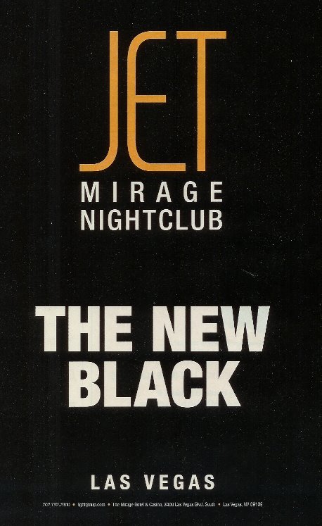
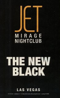 This is a great ad because of its simplicity. It is spare with words but rich with conveyed meaning. In fact, there are only 8 words in this ad (not counting the small print with the contact mechanism). While I have not visited Jet at the Mirage Nightclub in Las Vegas, I now know that it is popular, stylish ... perhaps rising above the level of trendiness. Black never goes out of style, regardless of the trendy, "in" color of the season. The ad tells me that Jet is "the new black," which says that I can't go wrong by choosing it. Like the color black, it is basic ... a staple, a necessary component. I love the typography of this ad. The simple, sans-serif font, presented in all caps is complemented by the ultra-contemporary font used for the word "Jet." Likewise, the ad is bold in its usage of color. White on black--reverse text. This treatment reinforces the metaphorical theme of "black." The unique selling proposition (USP) of this ad is straightforward. Jet promises the benefit of coolness ... of fitting in ... of being more popular by visiting this particular nightclub. The advertiser promises to save us the time and trouble of trying out a slew of nightclubs by taking us straight to the right choice. Almost all great ads communicate more by way of what is left out of the ad copy, instead of what is included in the ad copy. In advertising, less is definitely more. So, marketing geniuses, the next time you are working on an ad focus on cutting, condensing and distilling your copy. Whenever possible, say it through images and design--not through your ad copy. Labels: Great ads, marketing agencies; marketing firms; Charleston
Great Ads #5 - United
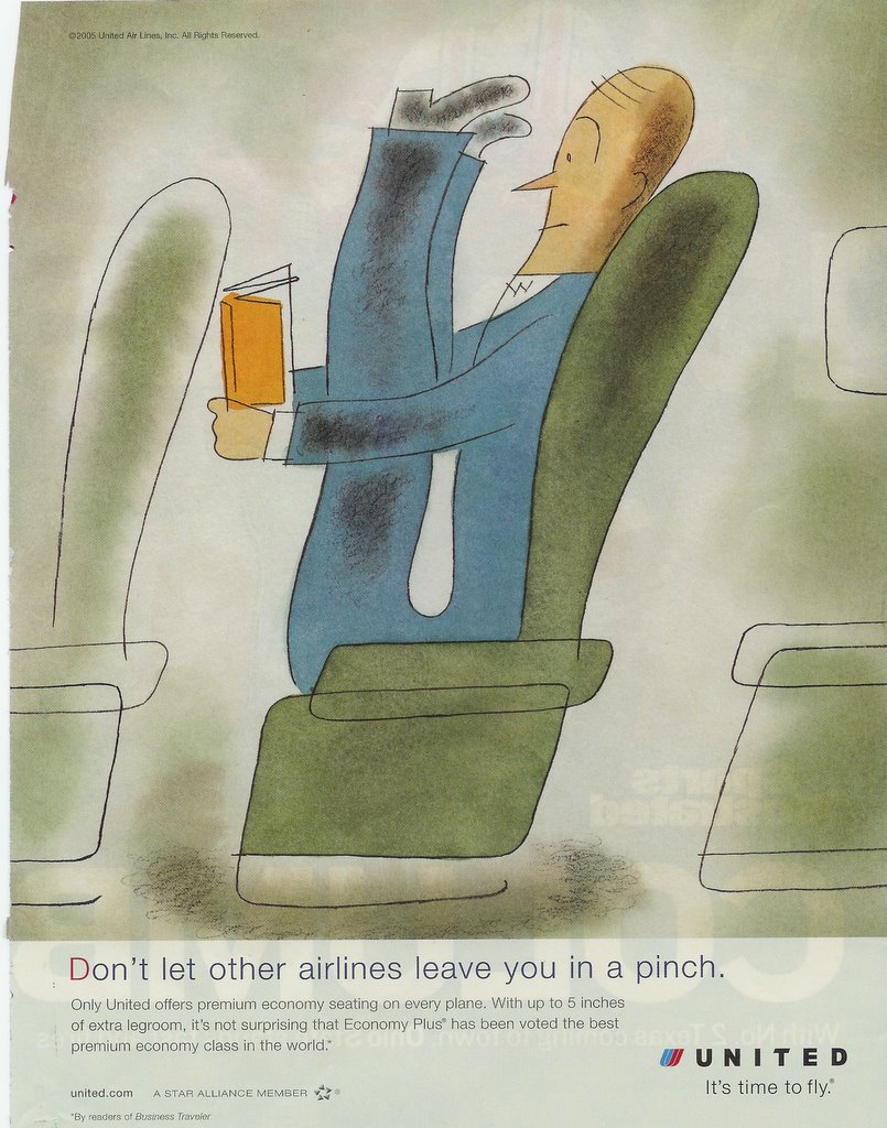
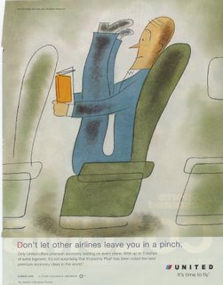 What makes this ad great is, quite obviously, a great illustration. It tells all or most of the story on its own. This ad for United Airlines, which ran on a full page in a November 2005 issue of Sports Illustrated, stopped me in my tracks with its unique illustration. The style of the art and the color palette are unusual, and the image is humorous. Anyone who has ever flown coach class has felt like the cartoon man in the ad. "Don't let other airlines leave you in a pinch," says the headline. The unique selling proposition (or USP) featured in this ad is legroom ... and more of it. "With up to 5 inches of extra legroom, it's not surprising that Economy Plus has been voted the best ...." So, what is the benefit of more legroom? Comfort. United is selling comfort. Their seating arrangement will make you feel better while you are flying. My hat is off to the marketing geniuses at United--or their ad agency--for some gorgeous art illustration and a great ad. Labels: Great ads, marketing agencies; marketing firms; Charleston
Great Ads #3 - Target
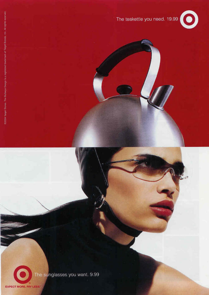
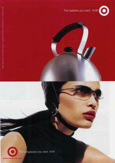 Target. Need we say more? This ad is clever graphically in the way the tea kettle emanates from the woman's head. The colors are bold, striking. The sunglasses are stylish. The model is beautiful. The whole theme of "Want vs. Need" is just purely superb, also. Plus, the company is bold enough to show actual retail prices for the items. Target understands "hip, cool" better than almost any other U.S. company, in my opinion. Kudos to the marketing geniuses at Target for "getting it." And a special kudo to Robyn Waters, who got Target's marketing to where it is now! Labels: Great ads, marketing agencies; marketing firms; Charleston
Great Ads #2 - Dyson
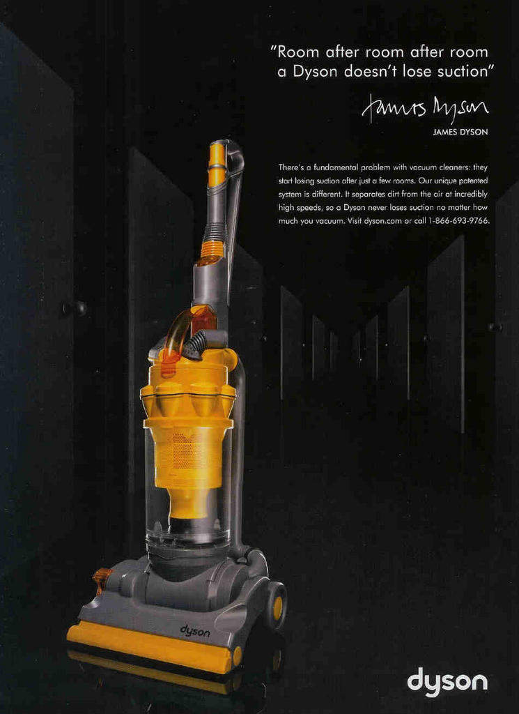
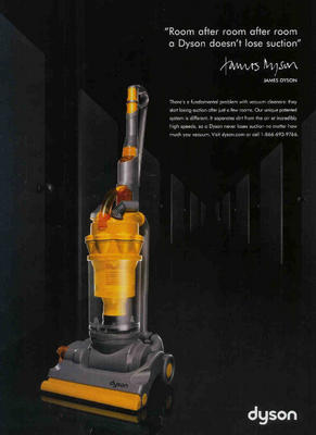 This ad from Dyson is the next in our continuing series of ads that we love. It appeared in the October issue of Vanity Fair. Visually, the reader is hammered with a bold product presentation. The bright yellow of the Dyson sweeper contrasts strongly with the black background of the ad. The product almost seems to float on the page. This great design helps to convey the sense that this product is unmistakably something different ... something special. It looks technologically advanced and ... well, hip. I love the fact that the owner of the company puts his name on the ad. This gives me a comfort feeling, a sense that the product will be supported with a strong guarantee or warranty. The Dyson USP (unique selling proposition) is impossible to miss, repeated in the headline and the copy: "Our sweeper does not lose suction." The cleverness of the Dyson campaign, overall, is the way in which it creates a concern in my mind that did not exist previously. To me, that is a hallmark of a great ad. The copy is tight, sparse and effective. I especially love the phrase "incredibly high speeds." For more on the Dyson campaign check here.Labels: Great ads, marketing agencies; marketing firms; Charleston
Great Ads #1 - Mack's Earplugs
 This is the first in a series of "Great Ads" that we'll be bringing to you periodically. Advertising is but one aspect of marketing. But it is one of the more visual forms of marketing. By examining and studying great ads, we think that we can all learn more about marketing ... adding to the collective marketing genius! The ad from Mack's shown above appeared in Newsweek, May 30, 2005 edition. Is it promoting ear plugs ... or peace of mind? The ad presents the promise of a restful night's sleep for the spouse of someone who snores. Prior to encountering this print ad in a magazine, I had never seen or heard of Mack's earplugs, despite the fact that the product has been around since 1962. What's great about this ad? Several things. First, there is the image. It is unique, cute and playful. I hope that all of you can relate to a snuggly cuddle in a warm, cozy bed. Doesn't that down comforter look inviting! The black & white photo makes the whole concept more abstract ... less specific, so that each of us can adapt it to fit our own life situation more readily. (Plus - feet probably look better in a fuzzy B&W photo than in sharp color.) The headline is hard to miss. It is a quotation, a testimonial from a man in Annapolis, Maryland. "You saved my marriage," that is a pretty powerful headline. In the Rosser Reeves vernacular, the unique selling proposition (or USP) of this product is a happier marriage. Cover up the thumbnail sized photo of the product package. Now, look at the ad again. It's hard to tell what the Mack's product is, minus the product shot. That one element is a nice addition to the ad. I really like the line in the footer of the ad: "Saving snore ravaged relationships since 1962." Makes me smile. That connected with me. The whole ad is folksy and inviting - in a very clever way. Labels: Great ads, marketing agencies; marketing firms; Charleston
|
|