Marketing tips, observations & philosophy, plus a few rants and random musings - from those who practice, preach and teach marketing, research, advertising, public relations and business strategy.
Great Ads #10 - We Can Solve It
 Whether you hug trees for a living, or chop them down, if you're able to set aside your personal feelings and allegiances, you can appreciate this great ad. This ad by The Alliance for Climate Protection was clipped from the December 2008 issue of GQ. What makes it so great? Let's take apart the elements. The stopper effect is very strong. First off, it is impossible to miss the gargantuan headline treatment with its nearly 2-inch tall font. Reminds me a bit of the famous "Dewey Beats Truman" headline of old. "Free us." It is a simple message in a world of increasingly complex messages. Next, I am taken by the unusual layout. You'll notice that the page is split vertically by image (on the left) and copy block (on the right). Most print ads today are designed with an image that spans the full page. If there is separate copy block is designed into the layout, the page is usually split horizontally with the image on top and copy below. In a metaphorical sense, this vertical split almost gives a sense of demarcation ... a new era, a change, etc ... if you think about a horizontal timeline or progression of time. The visual image is stark and unusual. How often do we see an oil tanker in an ad? The cropping of the photo and the perspective supplied by the camera angle combine to communicate the massive size of that sea-faring vessel. Finally, take a hard look at the ad copy. It is arranged in an unusual format, almost like a poem. Short lines, all contained to one row, and repetition are used to give the copy a choppy meter and an emphatic feel. And like all great ads, there is a distinct call-to-action or response mechanism. The advertiser clearly invites and urges the reader to go to the Web site to join their cause. No matter how green you are, we can all be a little green with envy over the creative genius of this print advertisement. Labels: advertising, Alliance for Climate Protection, Charleston, energy, Great ads, green, marketing firm, wecansolveit.org, West Virginia
Coming Up
Just finished up a great lunch discussion with Dave Pray. We had some very good discussion about the importance of voice and genuineness in social media. Voice - is it authentic ... is it relevant ... is it coherent? Is it your own? We've all seen those blogs or Facebook pages or Twitter presences with an unauthentic voice. Some owner or marketing director has hired a third-party to be the mouthpiece for the company on its social media vehicles. Guess what folks: you're not fooling any of us! As a marketing professional, I will only coach and counsel my clients on social media in order to make them effective and self-sufficient. I will not write for them. I am not the voice, because I do not have the soul, or the perspective or the nuances of language. In the weeks ahead, we have some new things coming up! Dave Pray will be guest authoring a blog post or two here. He has some great ideas cooking! Also, we have rejuvenated the very popular "Great Ads" series from a couple of years ago. To date, there have been eight posts in this series. Tim, Erin and Laura are working on a few new ones. I have a great ad clipped and ready to post, too. If you want to catch up on our "Great Ads" series - by all means do! Be sure to comment on your faves. Great Ads #1 - Mack's EarplugsGreat Ads #2 - DysonGreat Ads #3 - TargetGreat Ads #4 - CliniqueGreat Ads #5 - United AirlinesGreat Ads #6 - Schmitt Sohne WineryGreat Ads #7 - JET Mirage NightclubGreat Ads #8 - CanonLabels: authenticity, Charleston, Dave Pray, Great ads, marketing firm, presence, social media, voice, W.Va.
Great Ads #8 - Canon

Advertisement from June 2004 issue of Inc.
When I saw this I could not help but to laugh! Would this really work in a real situation? Maybe not, but Canon sure does make it believable. Even if it is something that may not really keep someone out of the seat,
IT IS STILL HILARIOUS!
Canon has done a great job here bringing real life, "everyday," experiences together with a product inclusion as a comedic relief. You can see the product, you can see what it does, you can see how well it does it, and you can see how, in this scenario, it has become the bearer of the gentleman's burden. As it produces such crystal clear images that it has accomplished it's tasked goal; "Can't Sit There." Anytime you use comedy to advertise, and do it right ...
IT WORKS!
Thanks for the good advertising theme Canon, and THANKS for the laugh!Labels: advertising, Great ads, marketing agencies; marketing firms; Charleston, print ads, West Virginia, WV
Great Ads #7: Jet Mirage Nightclub
 This is a great ad because of its simplicity. It is spare with words but rich with conveyed meaning. In fact, there are only 8 words in this ad (not counting the small print with the contact mechanism). While I have not visited Jet at the Mirage Nightclub in Las Vegas, I now know that it is popular, stylish ... perhaps rising above the level of trendiness. Black never goes out of style, regardless of the trendy, "in" color of the season. The ad tells me that Jet is "the new black," which says that I can't go wrong by choosing it. Like the color black, it is basic ... a staple, a necessary component. I love the typography of this ad. The simple, sans-serif font, presented in all caps is complemented by the ultra-contemporary font used for the word "Jet." Likewise, the ad is bold in its usage of color. White on black--reverse text. This treatment reinforces the metaphorical theme of "black." The unique selling proposition (USP) of this ad is straightforward. Jet promises the benefit of coolness ... of fitting in ... of being more popular by visiting this particular nightclub. The advertiser promises to save us the time and trouble of trying out a slew of nightclubs by taking us straight to the right choice. Almost all great ads communicate more by way of what is left out of the ad copy, instead of what is included in the ad copy. In advertising, less is definitely more. So, marketing geniuses, the next time you are working on an ad focus on cutting, condensing and distilling your copy. Whenever possible, say it through images and design--not through your ad copy. Labels: Great ads, marketing agencies; marketing firms; Charleston
Great Ads #5 - United
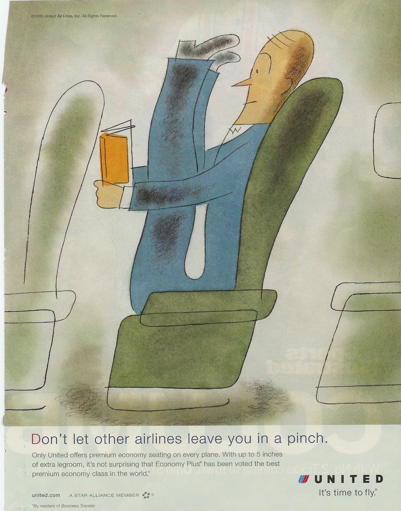
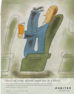 What makes this ad great is, quite obviously, a great illustration. It tells all or most of the story on its own. This ad for United Airlines, which ran on a full page in a November 2005 issue of Sports Illustrated, stopped me in my tracks with its unique illustration. The style of the art and the color palette are unusual, and the image is humorous. Anyone who has ever flown coach class has felt like the cartoon man in the ad. "Don't let other airlines leave you in a pinch," says the headline. The unique selling proposition (or USP) featured in this ad is legroom ... and more of it. "With up to 5 inches of extra legroom, it's not surprising that Economy Plus has been voted the best ...." So, what is the benefit of more legroom? Comfort. United is selling comfort. Their seating arrangement will make you feel better while you are flying. My hat is off to the marketing geniuses at United--or their ad agency--for some gorgeous art illustration and a great ad. Labels: Great ads, marketing agencies; marketing firms; Charleston
Great Ads #3 - Target
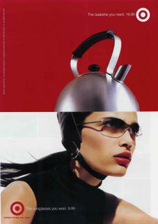 Target. Need we say more? This ad is clever graphically in the way the tea kettle emanates from the woman's head. The colors are bold, striking. The sunglasses are stylish. The model is beautiful. The whole theme of "Want vs. Need" is just purely superb, also. Plus, the company is bold enough to show actual retail prices for the items. Target understands "hip, cool" better than almost any other U.S. company, in my opinion. Kudos to the marketing geniuses at Target for "getting it." And a special kudo to Robyn Waters, who got Target's marketing to where it is now! Labels: Great ads, marketing agencies; marketing firms; Charleston
Great Ads #2 - Dyson
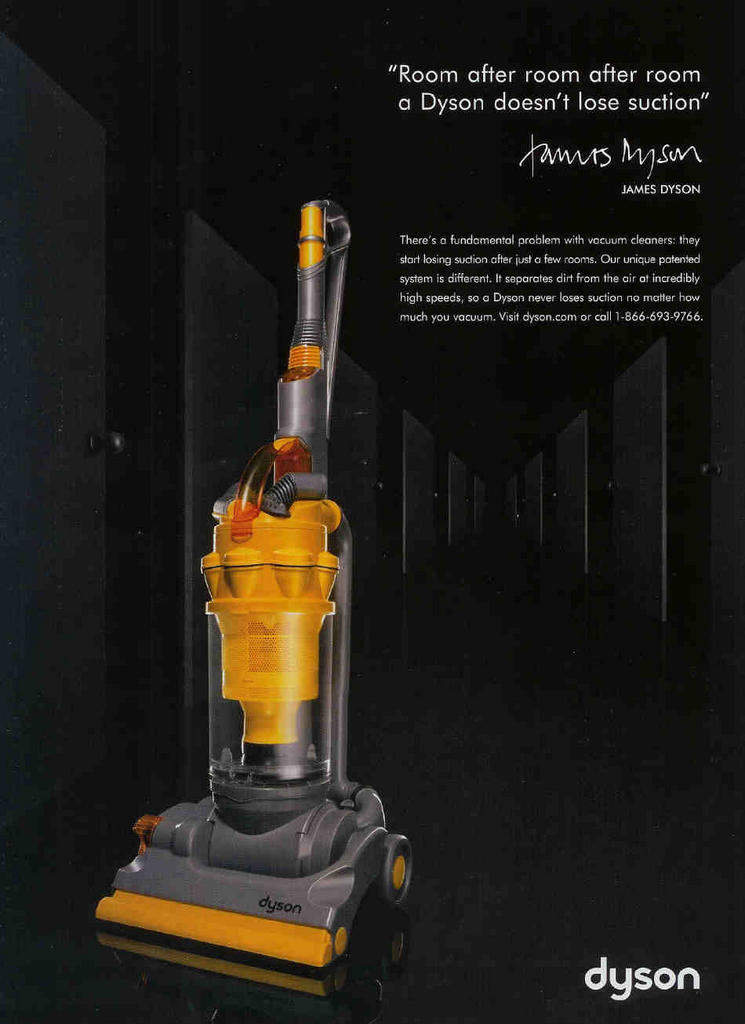
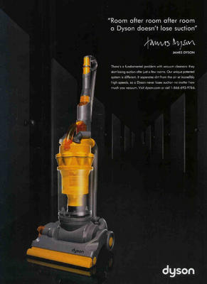 This ad from Dyson is the next in our continuing series of ads that we love. It appeared in the October issue of Vanity Fair. Visually, the reader is hammered with a bold product presentation. The bright yellow of the Dyson sweeper contrasts strongly with the black background of the ad. The product almost seems to float on the page. This great design helps to convey the sense that this product is unmistakably something different ... something special. It looks technologically advanced and ... well, hip. I love the fact that the owner of the company puts his name on the ad. This gives me a comfort feeling, a sense that the product will be supported with a strong guarantee or warranty. The Dyson USP (unique selling proposition) is impossible to miss, repeated in the headline and the copy: "Our sweeper does not lose suction." The cleverness of the Dyson campaign, overall, is the way in which it creates a concern in my mind that did not exist previously. To me, that is a hallmark of a great ad. The copy is tight, sparse and effective. I especially love the phrase "incredibly high speeds." For more on the Dyson campaign check here.Labels: Great ads, marketing agencies; marketing firms; Charleston
Great Ads #1 - Mack's Earplugs
 This is the first in a series of "Great Ads" that we'll be bringing to you periodically. Advertising is but one aspect of marketing. But it is one of the more visual forms of marketing. By examining and studying great ads, we think that we can all learn more about marketing ... adding to the collective marketing genius! The ad from Mack's shown above appeared in Newsweek, May 30, 2005 edition. Is it promoting ear plugs ... or peace of mind? The ad presents the promise of a restful night's sleep for the spouse of someone who snores. Prior to encountering this print ad in a magazine, I had never seen or heard of Mack's earplugs, despite the fact that the product has been around since 1962. What's great about this ad? Several things. First, there is the image. It is unique, cute and playful. I hope that all of you can relate to a snuggly cuddle in a warm, cozy bed. Doesn't that down comforter look inviting! The black & white photo makes the whole concept more abstract ... less specific, so that each of us can adapt it to fit our own life situation more readily. (Plus - feet probably look better in a fuzzy B&W photo than in sharp color.) The headline is hard to miss. It is a quotation, a testimonial from a man in Annapolis, Maryland. "You saved my marriage," that is a pretty powerful headline. In the Rosser Reeves vernacular, the unique selling proposition (or USP) of this product is a happier marriage. Cover up the thumbnail sized photo of the product package. Now, look at the ad again. It's hard to tell what the Mack's product is, minus the product shot. That one element is a nice addition to the ad. I really like the line in the footer of the ad: "Saving snore ravaged relationships since 1962." Makes me smile. That connected with me. The whole ad is folksy and inviting - in a very clever way. Labels: Great ads, marketing agencies; marketing firms; Charleston
|
|


 Whether you hug trees for a living, or chop them down, if you're able to set aside your personal feelings and allegiances, you can appreciate this great ad. This ad by The Alliance for Climate Protection was clipped from the December 2008 issue of GQ.