

Great Ads #7: Jet Mirage Nightclub
This is a great ad because of its simplicity. It is spare with words but rich with conveyed meaning. In fact, there are only 8 words in this ad (not counting the small print with the contact mechanism).
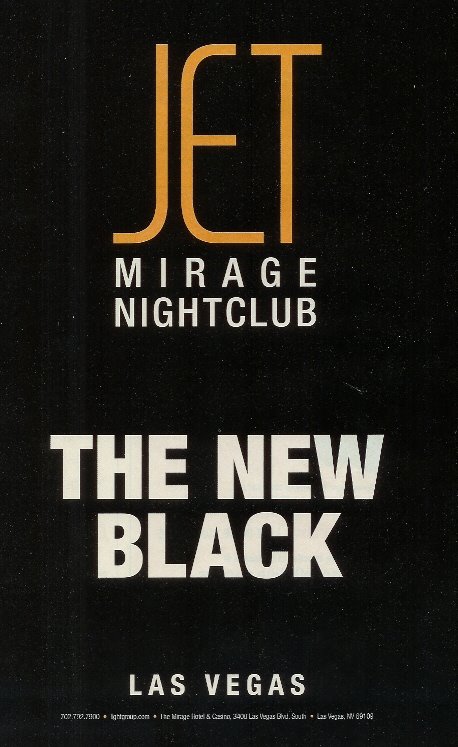
While I have not visited Jet at the Mirage Nightclub in Las Vegas, I now know that it is popular, stylish ... perhaps rising above the level of trendiness. Black never goes out of style, regardless of the trendy, "in" color of the season. The ad tells me that Jet is "the new black," which says that I can't go wrong by choosing it. Like the color black, it is basic ... a staple, a necessary component.
I love the typography of this ad. The simple, sans-serif font, presented in all caps is complemented by the ultra-contemporary font used for the word "Jet." Likewise, the ad is bold in its usage of color. White on black--reverse text. This treatment reinforces the metaphorical theme of "black."
The unique selling proposition (USP) of this ad is straightforward. Jet promises the benefit of coolness ... of fitting in ... of being more popular by visiting this particular nightclub. The advertiser promises to save us the time and trouble of trying out a slew of nightclubs by taking us straight to the right choice.
Almost all great ads communicate more by way of what is left out of the ad copy, instead of what is included in the ad copy. In advertising, less is definitely more. So, marketing geniuses, the next time you are working on an ad focus on cutting, condensing and distilling your copy. Whenever possible, say it through images and design--not through your ad copy.
Labels: Great ads, marketing agencies; marketing firms; Charleston
posted by Skip Lineberg at 9:33 PM
![]()


0 Comments:
Post a Comment
<< Home