More Hidden Logo Design Elements

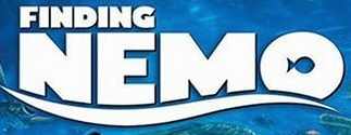
As the parent of two young children, I had seen the "Finding Nemo" logo hundreds of times. Then, strangely, the other day when I found the CD case lying on the dining room table I saw--for the first time--a hidden design element in the logo.
Do you see it yet?
If not, perhaps you will need to fish around a bit.
Have fun, marketing geniuses!
If you like these "Hidden Logo Design Elements" brain teasers, here are a few from the past.
Goodwill
Big Ten Conference
FedEx


4 Comments:
I love these sort of subtle logos and images really enjoyed those two on your blog, thanks for putting them up
_________________
wealth secrets
1:45 PM
its really nice clues for me who really want to be in branding field
2:19 AM
This may seem silly, but other than the little fish in the letter "o" is there something else I am missing? I sat back and let my eyes go out of focus and immediately, I saw something. The whole logo looks like a blue whale's head swimming from the right to the left. The swoosh is his mouth and the little fish is his eye. Let me know what you think please!
2:38 AM
Jeremiah- You've taken it to a whole new level! When I initially posted this, I was only seeing the little fish that is embedded in the negative space of the letter "o" in "Nemo." Now I see the whale's head!
Thanks for contributing your creative eyes and observation to the blog!
Skip
12:15 PM
Post a Comment
<< Home